UX Research & Roadmap
Strings had users, but the product tried to be a little bit for everyone. Which handful of use cases should the roadmap narrow in on first?
- +14%
- D7 retention
- 21
- user interviews
- 3
- core personas & JTBD
Context
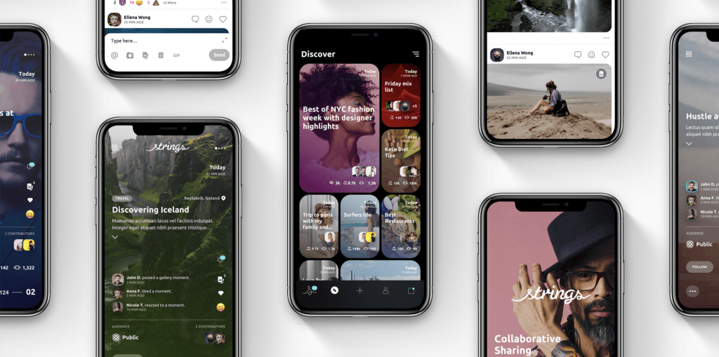
Strings is a content publishing and social app. Where existing platforms are built around standalone posts, Strings let users share ongoing topical threads and build more collaboratively. When I joined, there was an MVP with beta users, no defined target market, and a UI that was pretty but had real UX problems.
Strings was one of two products I worked on as part of a venture studio effort, alongside AiMi, the generative music platform that later raised a $20M Series A.
Our two product goals were to get users creating content and growing their own audiences. I narrowed research to two questions: which UX issues to prioritize first, and who our users actually were, defined through personas and their Jobs-to-be-Done, to drive the roadmap.
Leading the research
I made the case that even a handful of the right conversations would beat pure intuition at this stage, and our head of engineering agreed we needed that clarity to build a predictable roadmap.
Over two months we recruited beta users and incentivized non-users with gift cards, screening for a diverse group by age, gender, race, and interests. We combined usability testing, walking people through real tasks like creating a "string" about a trip or inviting a friend, with open questions about how they saw themselves using the app.
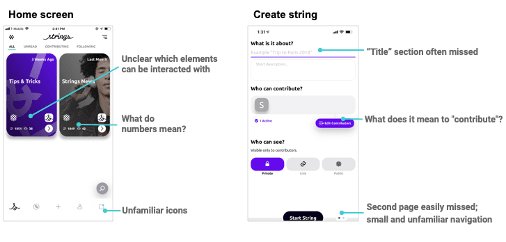
Of 21 user interviews, only 3 knew how to interact with the app's cards, and none understood all the icons: concrete, prioritizable findings rather than vague complaints. We recorded every session, wrote notes after each, and sorted findings into UX issues (easy to categorize) and use cases, using Jobs-to-be-Done in the form of Users/Situations/Motivations/Outcomes.
From findings to roadmap
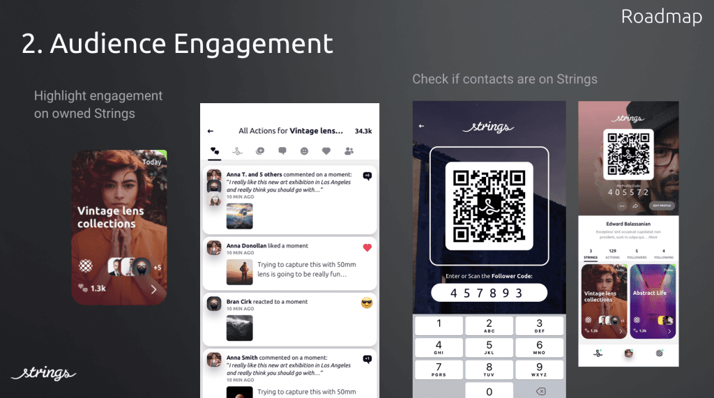
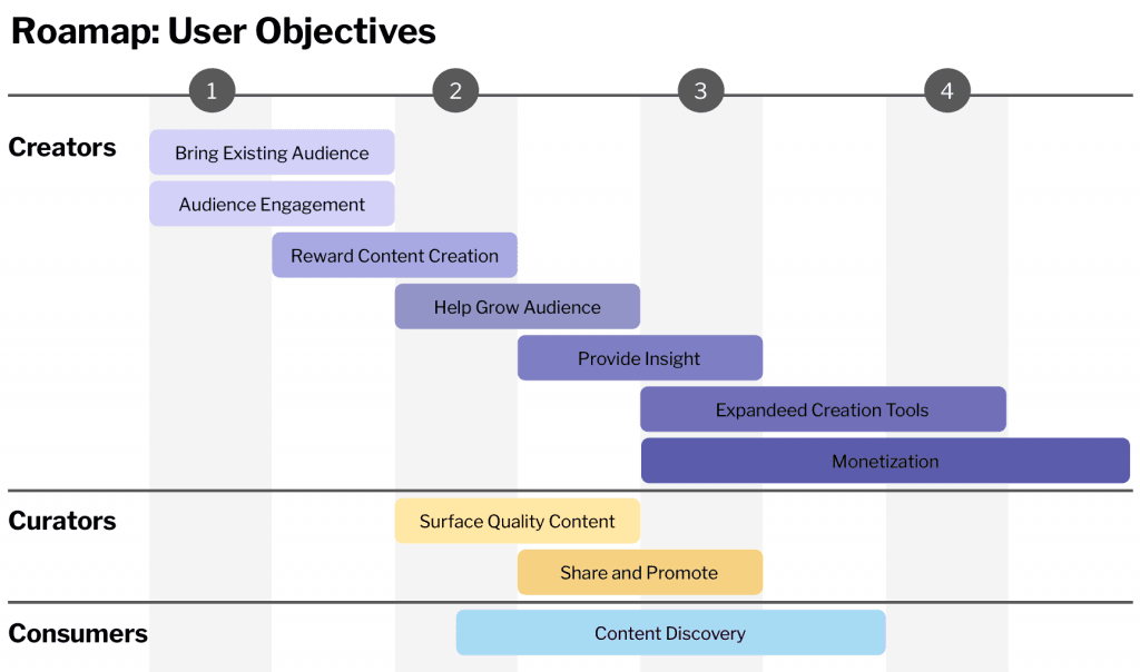
The output was a findings deck that fed directly into the company's first detailed roadmap. We prioritized fixes aimed at retention, then tracked new-user activity at day 1, day 7, and day 30, along with content-creation metrics, after shipping changes.
Results
We saw a large, positive change across every metric we tracked (a 14% increase in D7 retention among them), though as a small startup making constant changes, it's hard to attribute results to any single change in isolation.
The findings also shaped proposals that brought in the Hadid sisters, T-Mobile, and UNICEF as experimental partners.
That momentum led to VC commitments for a $15M Series A, which fell through when COVID-19 upended the agreements.