Zillow Usability Testing and Redesign
An unsolicited usability teardown of Zillow's iOS app, prompted by house-hunting frustrations of my own.
Several of the issues identified here have since been addressed by Zillow independently.
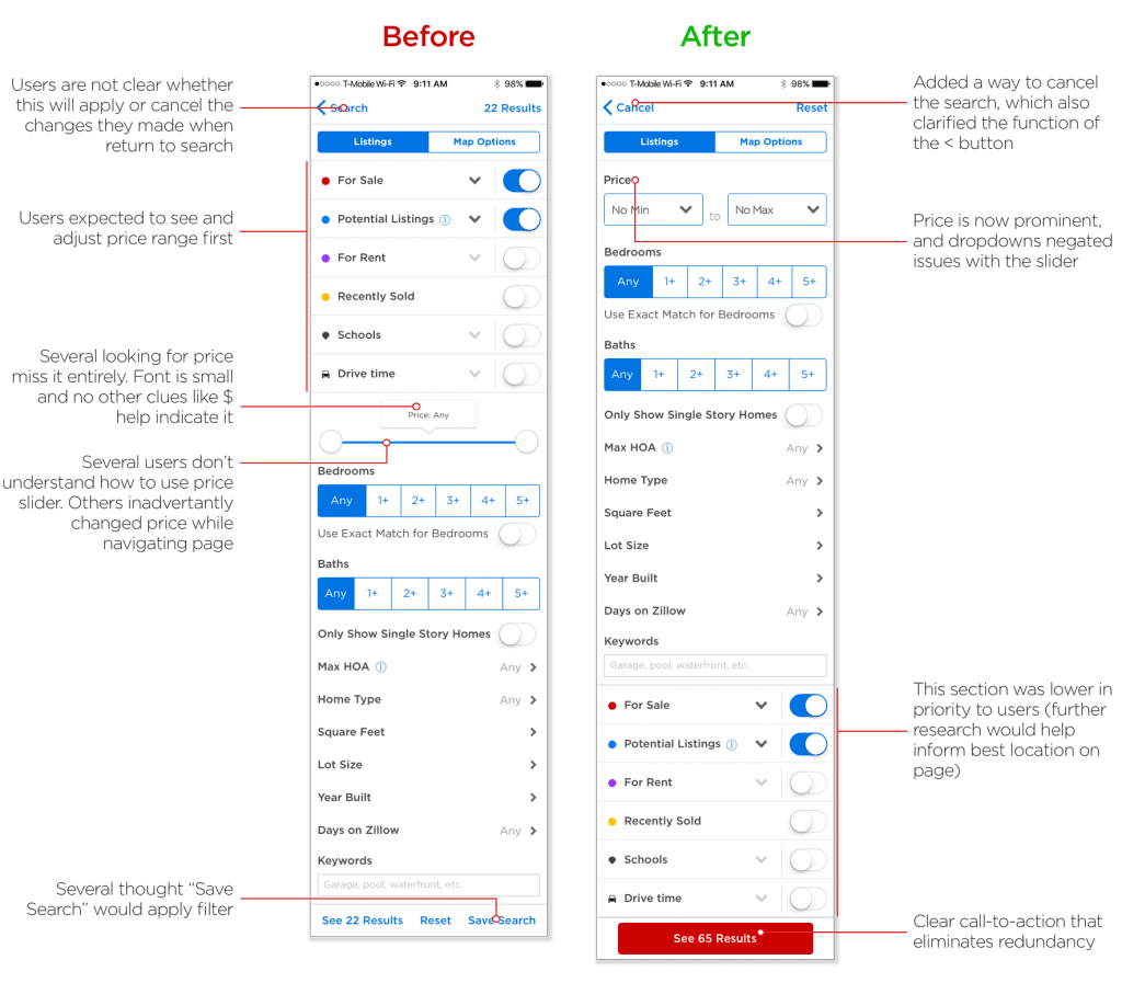
When my wife and I were house-hunting after our first baby, we both ran into friction using Zillow's app. I wondered if it was just us, so I ran a usability test, interviewing seven people (five is usually enough to surface most issues) as they worked through two scenarios: searching within a $900K budget, then adjusting to a $5M one.
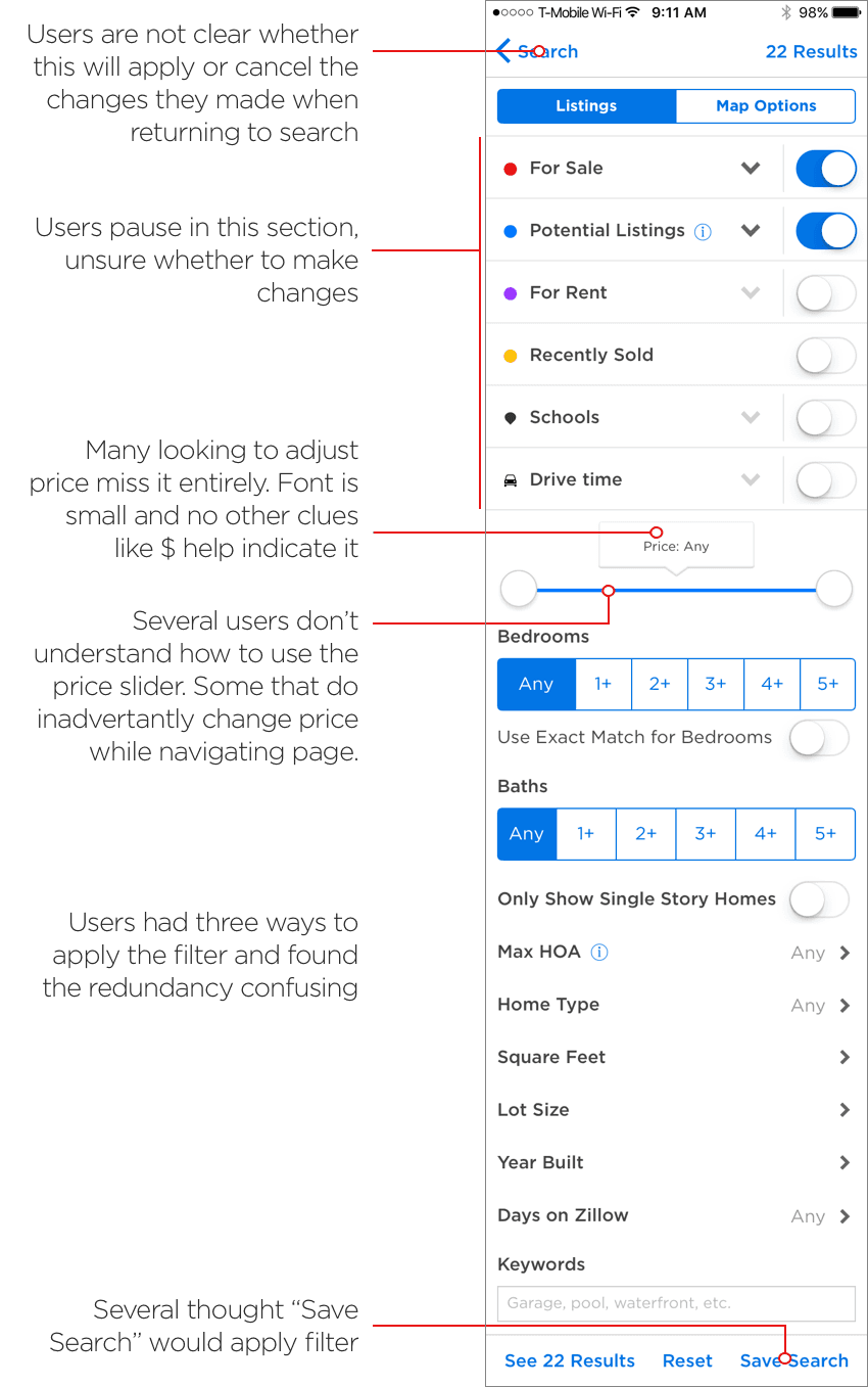
Two primary issues stood out, among several found
- 01Non-intuitive filtering
- 02A confusing price slider
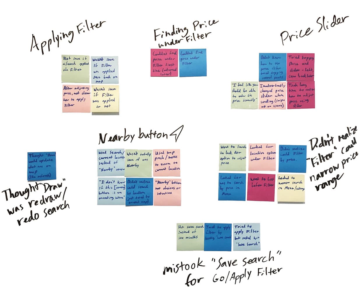
I built a proto-persona and task flow from a National Association of Realtors survey, categorized what I'd seen into recurring themes, then sketched alternative solutions on paper before building a clickable prototype in Marvel.
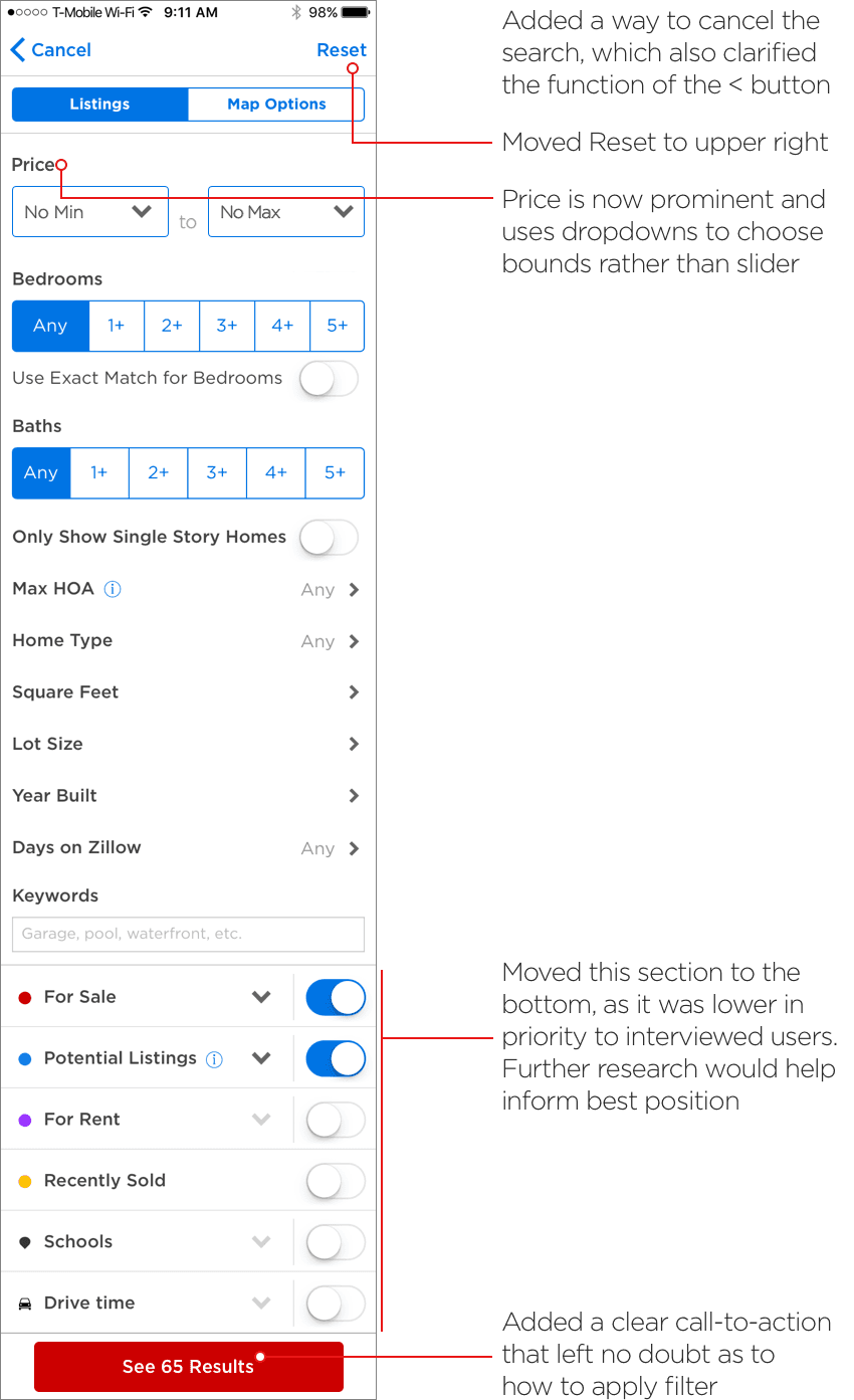
I re-tested the prototype with seven new participants running the same two tasks. This time, none of the original issues showed up.

Zillow may have had reasons for their original design I couldn't see as an outsider, but the before/after comparison was a clean piece of evidence that the changes worked.